Dying to win!
Every year we get the opportunity to vote on people who ”significantly improve the gene pool by eliminating themselves from the human race in an obviously stupid way!
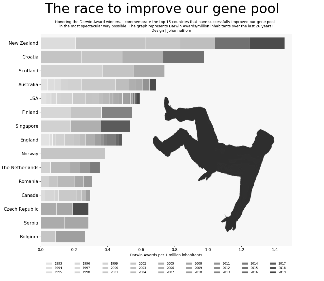
Via the Darwin Award webpage. This has been an ongoing thing since 1993 and there are SO many nominees, like:
- Rhino Poacher Killed By Elephant And Eaten By Lions (South Africa, 2019)
- Masturbator Meets Hard End (Michigan, 2016)
- MCigarette Lighter Triggers Fatal Explosion (Indiana, 1996)
I wanted to applaud the human effort by examining which countries has contributed the most in protecting the gene pool.
Congratulations New Zealand, Croatia, Scotland, Australia and the U.S for top 5 placement in making our world a better place!
work flow
- I collected the data from the Darwin Award’s webpage. All awards with an easy access of country origin was selected. In total, 59 countries have earned at least one Darwin Award the last 26 years (USA has info about each state but in this graph the data is treated as one country)
- Separately, I collected population data (this data is static, but population has not spiked during this timeframe– so the image should be accurate)
- I merged the two DataFrames into one and calculated the total Darwin awards per 1 million inhabitants. To avoid a skewed result, countries with a population smaller than 4 million was excluded. This made the total into 53 countries.
- I wanted to visualize the data as a time series, therefore, I created a pivot table to be able to make a stacked bar chart. I then identified the top 15 countries, re-indexed the data, created the bar chart and added the background image!
(PS This is one of my favorite graphs!)